About us
We're proud to be a B Corp Certified web design and development agency.
5 min read

Your brand identity is made up of a range of different visual elements. Each of them plays a role in setting your brand apart from your competitors.
It’s easy to look at a brand and take note of the colours used and overall design, but the typography almost always gets overlooked. This might be because not many people know much about type, and even if you do, there’s what seems like a never-ending supply of fonts available to choose from; many are just variants inspired by others that have been copied from previous versions. It’s a minefield.
“Can I copy your font?”
“Yeah, just change it up a bit so it doesn’t look obvious”.
Typography will almost always make up the most of a brand identity. From websites, social media, marketing collateral, and the brand logo itself, it all needs to have a consistent visual theme. It’s a difficult and often overlooked part of any designer's job. Like an impossible dark art, we’re supposed to be able to pick a font that creates harmony and sets the overall tone of a brand.
Should it focus on legibility or aesthetics? Does it match the other components of the brand? Will it be easily available for my client to use? These are all common questions, and whether you’re reading this as a designer or just want to learn a little more about typography, I’m going to give you a quick sneak peek into my decision-making process.
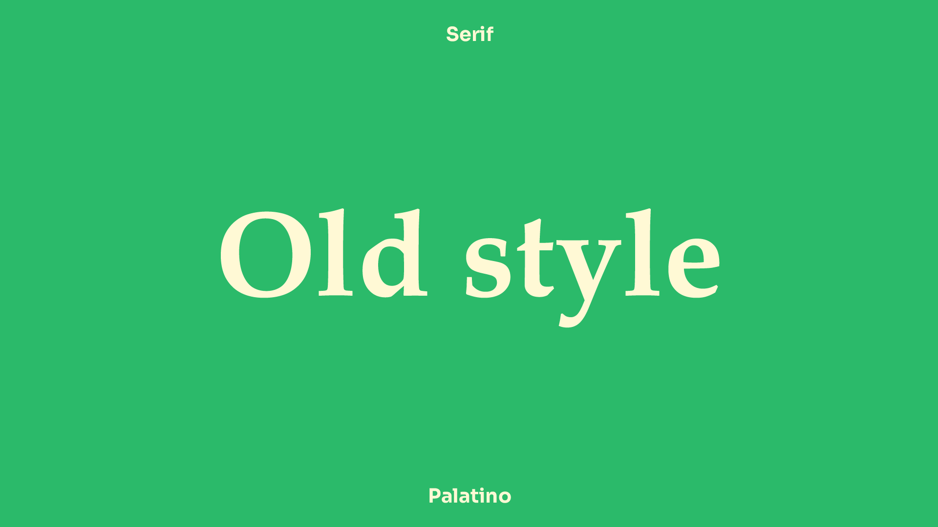
Serif fonts are the oldest, most classic typeface. A 'serif' is a small decorative line at the end of a character's stroke. The most popular example of a serif typeface is Times New Roman, one of the default fonts featured on Microsoft products for as long as I can remember. Have you got an elegant, traditional brand to work on? Then a serif typeface might be your best match. They promote trust, and as any young whippersnapper should know, you always respect your elders.
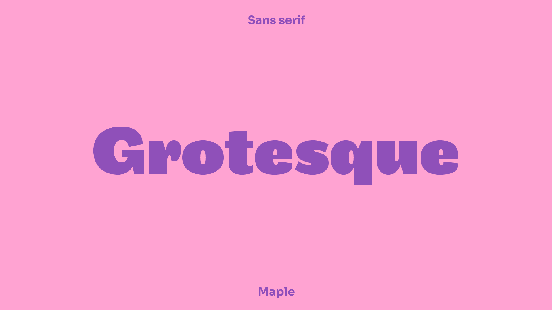
Sans serif fonts are clean, modern, and, most times, very easy to read. A digitally savvy person might tell you that sans serifs work better at lower resolutions and therefore are optimal for readability but let’s not get into details. We live in the modern world, where things are currently following the trend of being clean and no-nonsense. You want a brand to fit into this theme, limit your searches down to a simple sans serif, and you’re onto a winner.
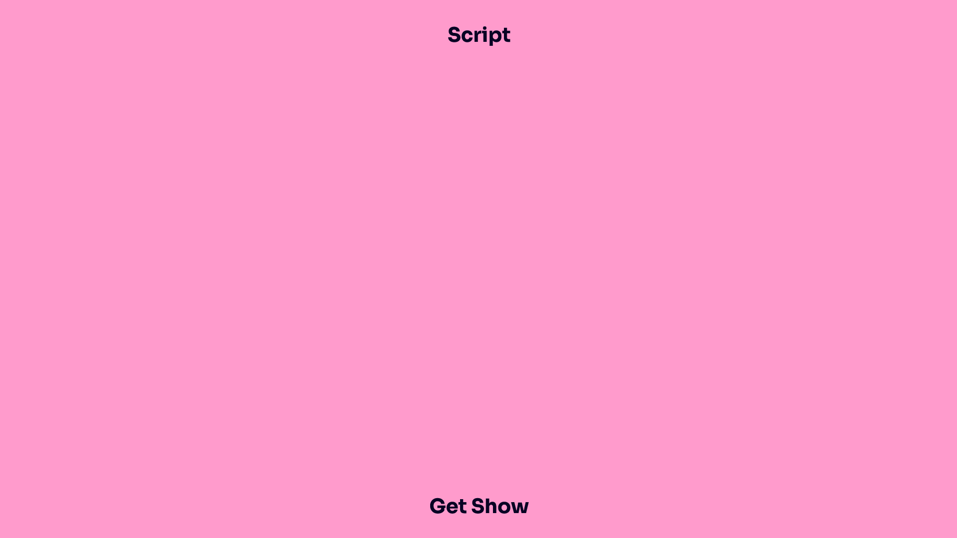
So, that’s fancy. Script fonts resemble handwritten lettering and embody sophistication and creativity. Because they are based on the handwritten style, they give your brand a personal, human appearance. I love a good script font, but pay close attention to the word ‘good’. The internet is full of bad script fonts, and I’ve spent endless hours selecting the finest script fonts the world has ever seen.
Now I can’t give you access to my secret vault because I’d be out of a job, but I will say that you have to be careful if you want to include a script style font into your brand. This is because they often aren’t very legible or readable, so I’d recommend using them as a secondary font to help you boost the human feeling of your brand and pair it with a clean sans serif.
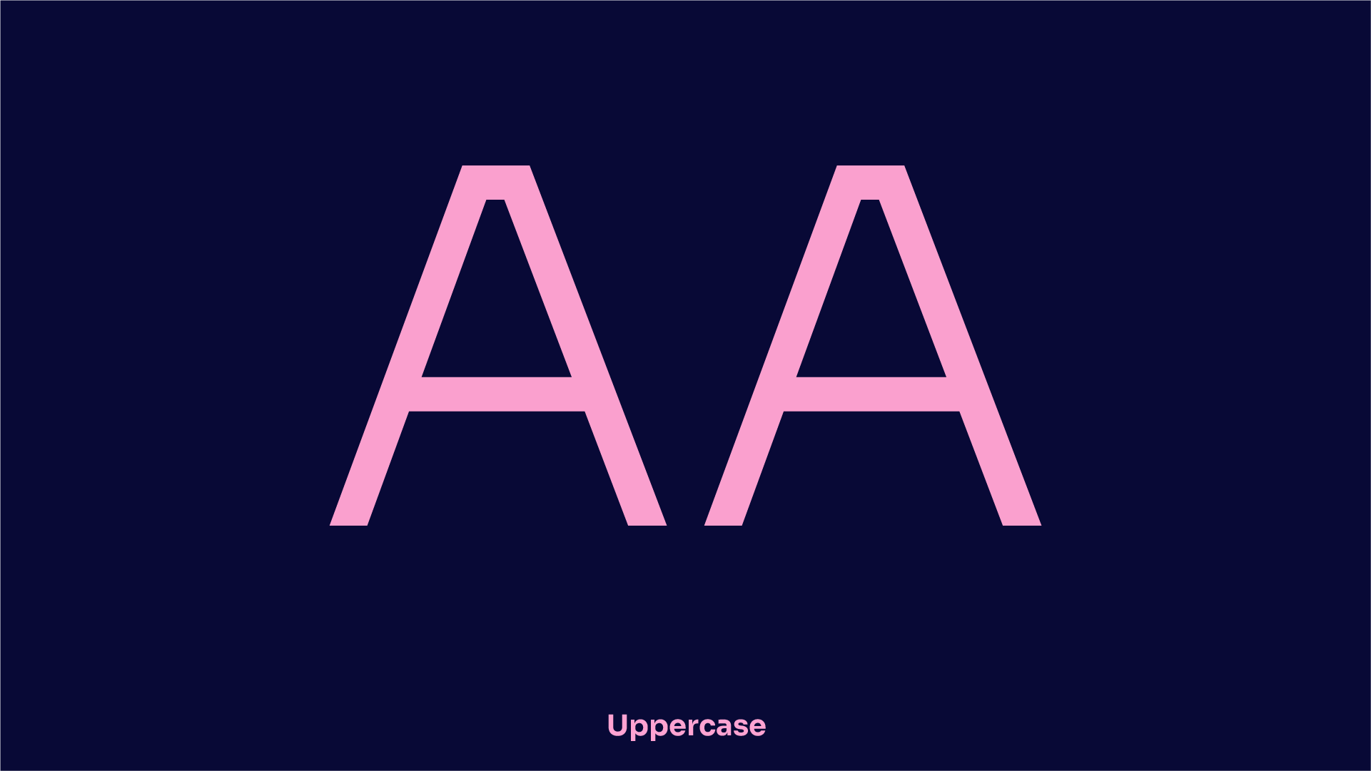
Now that you’ve picked a font for your brand, you’ve got to decide whether you want to use traditional grammar conventions or go all upper or lowercase. I often go with what looks best on-screen, but there have been countless experiments to see what people favour. All lowercase is often perceived as progressive or modern, whilst all uppercase is for the bold and brave.
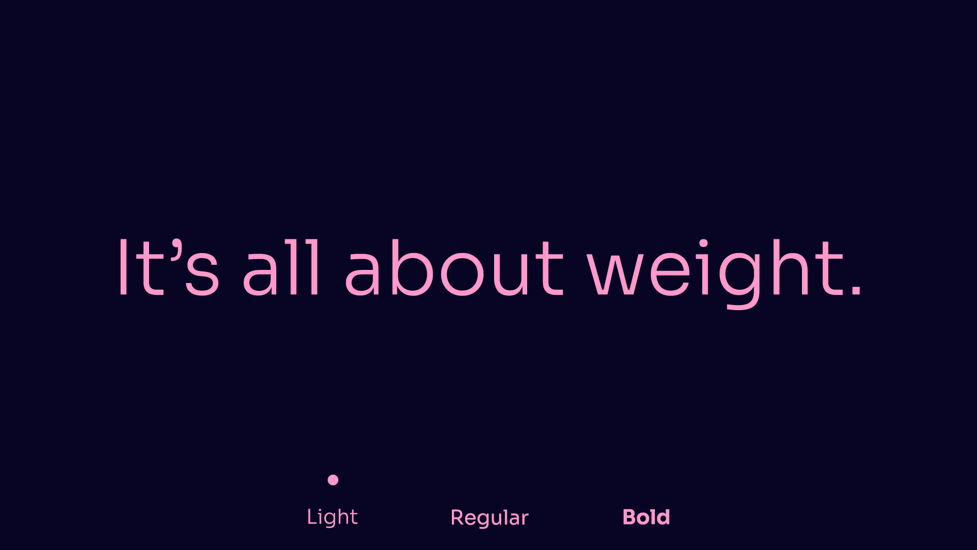
There’s a lot to be said for successful font weighting. It’s all about contrast, is the visual ordering of your chosen typeface going to communicate the message correctly? Be experimental with font weights and sizes. There is no definitive rule on weights, and all fonts are different; some look better with a softer, lightweight and others are bold. With that being said, it’s always better to try and pick a typeface that comes with multiple weights, giving you the freedom to be creative.

I’m not talking about my extraordinary ability to sense imminent danger, but there is a certain skill in knowing when your font choice works. I haven’t quite come up with a suitable name for it, but it’s that feeling you get when you look at a typeface alongside your brand colours, logo, and tone of voice, and it just fits.
Design is very opinionated, and someone will always disagree with you but fight your corner. You’ve picked this typeface because it matches the other brand elements. Trust your senses; if it looks right, it probably is.
Looking to level up your brand identity or simply make a few subtle changes to give it the refresh it deserves? Get in touch and we'd be happy to discuss how Abstrakt can bring new life to your branding.
8 min read

5 min read

4 min read