Bright Beany
Bright Beany supports small businesses with better financial decisions, assists their growth and helps them become more profitable and productive.
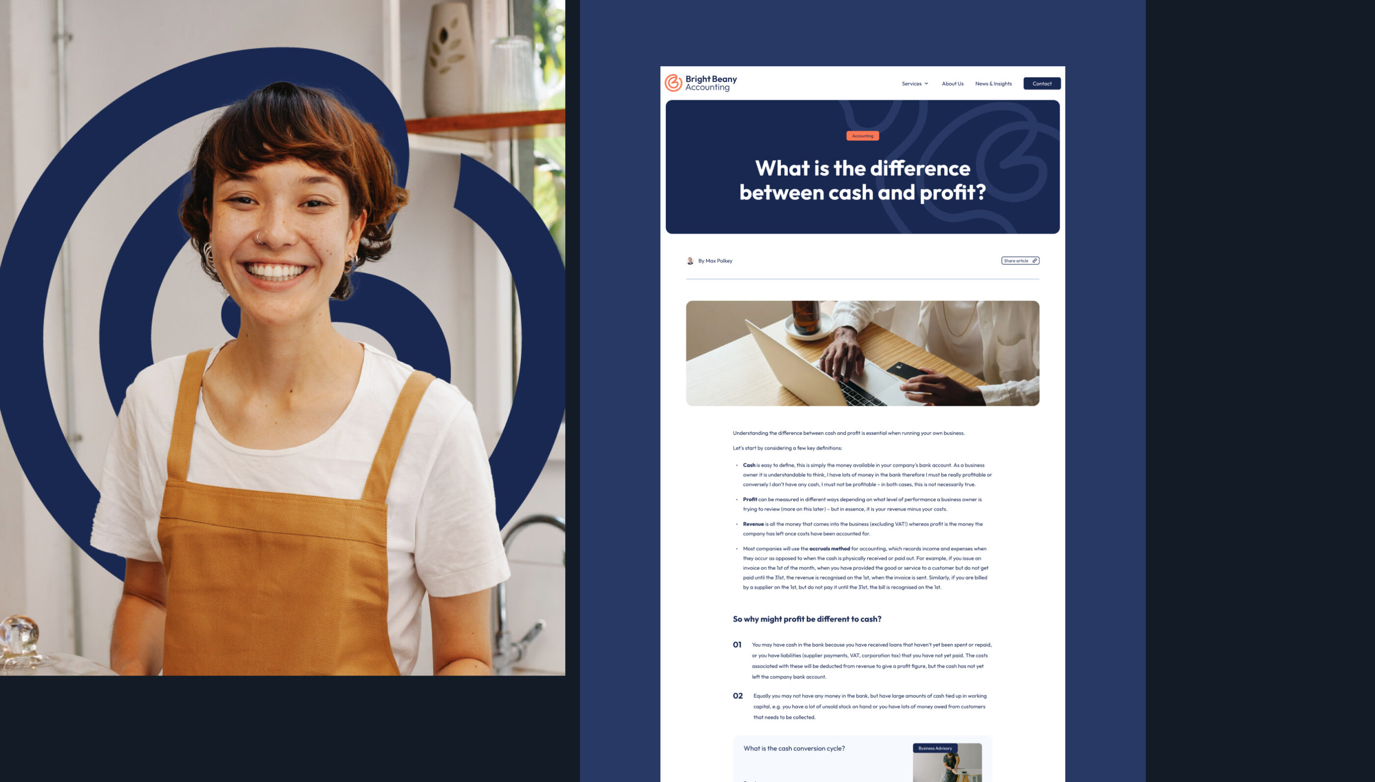
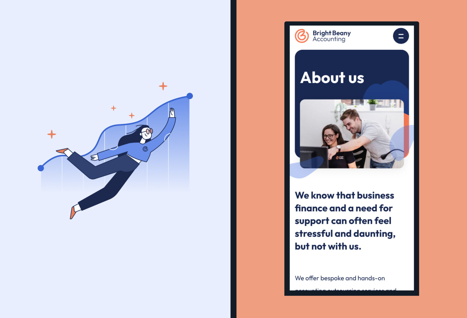
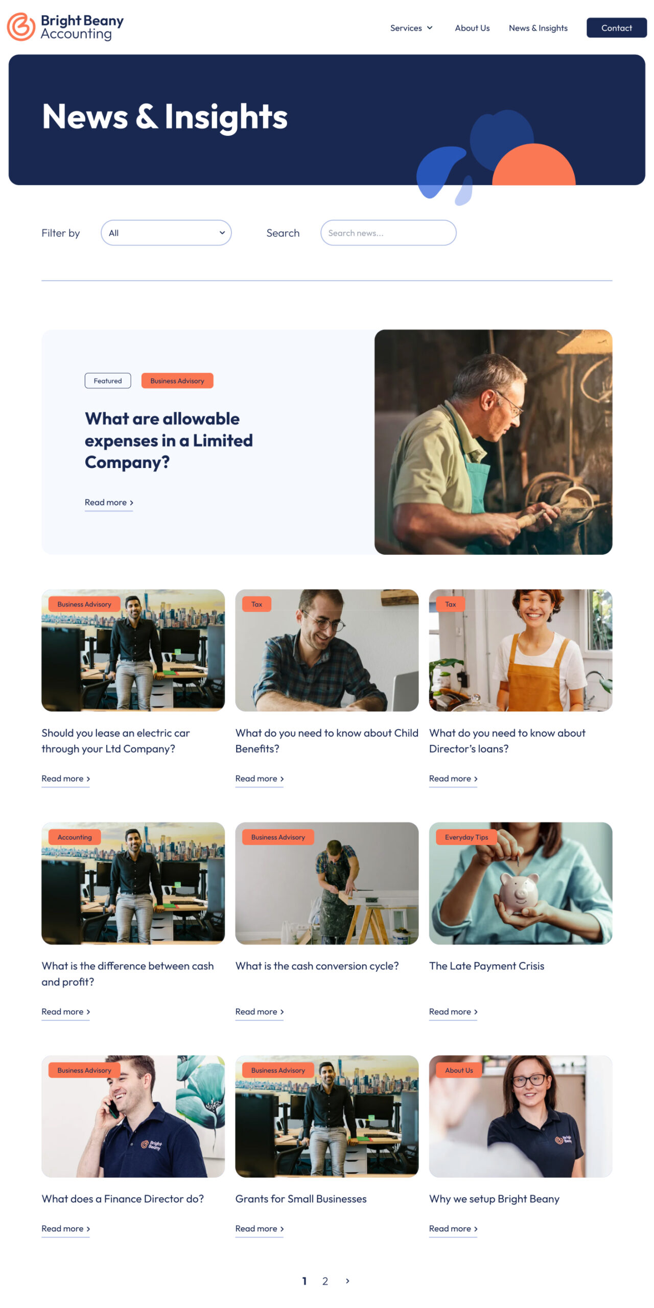
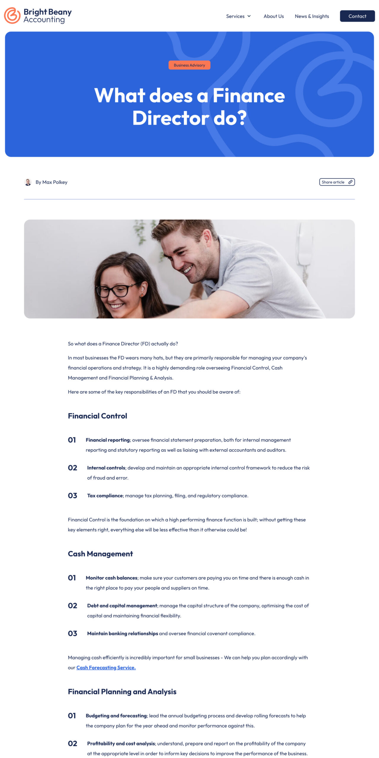
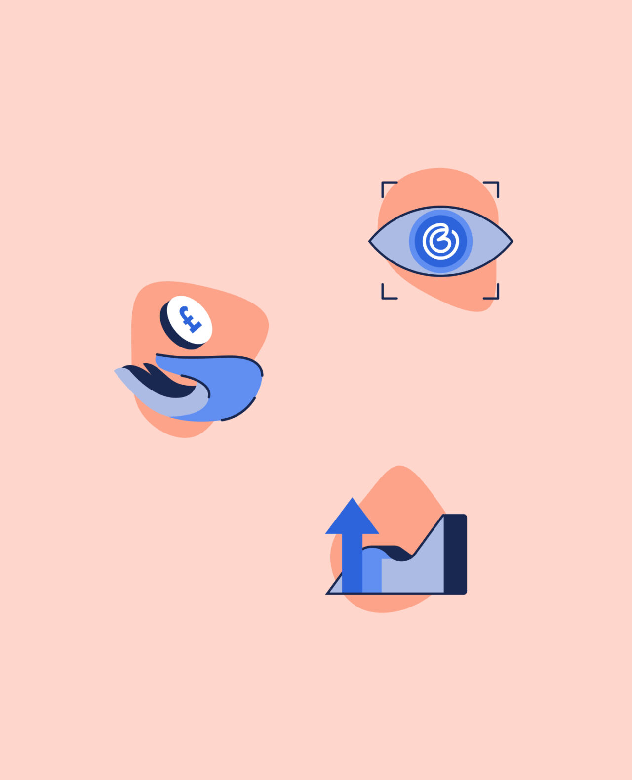
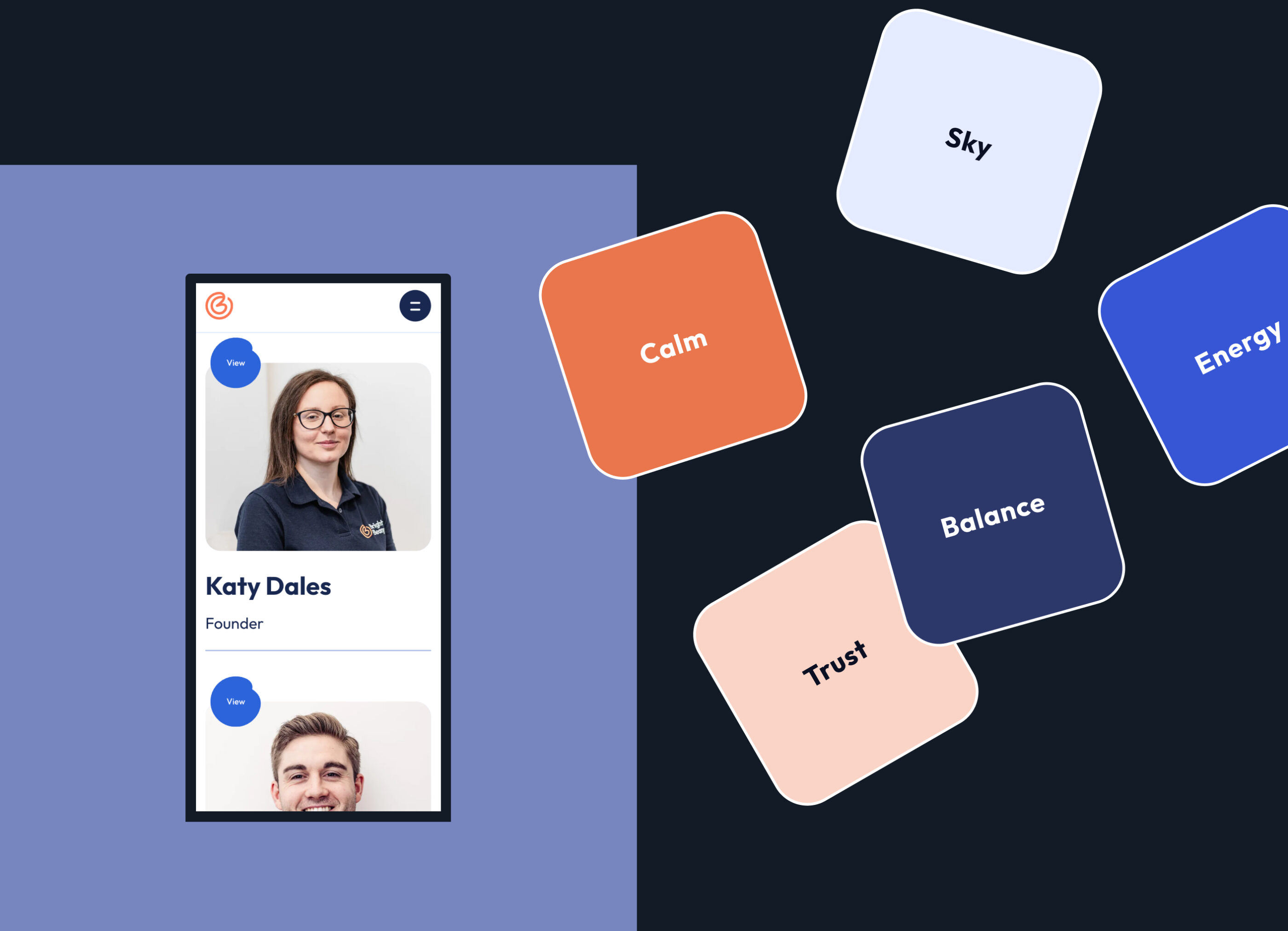
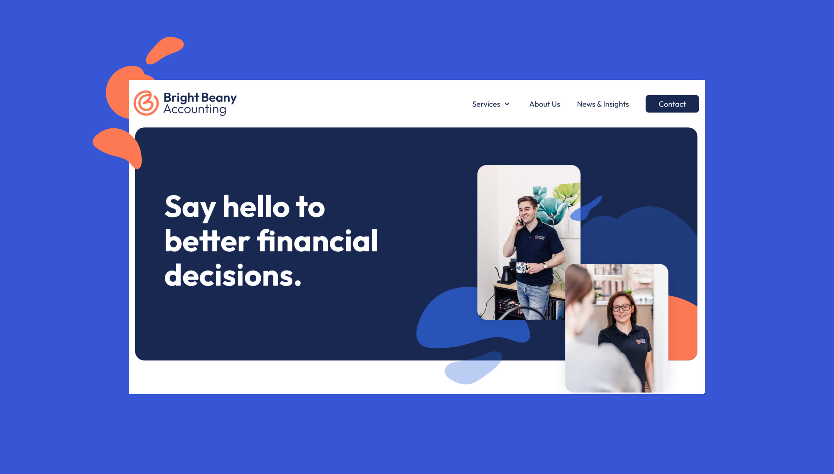
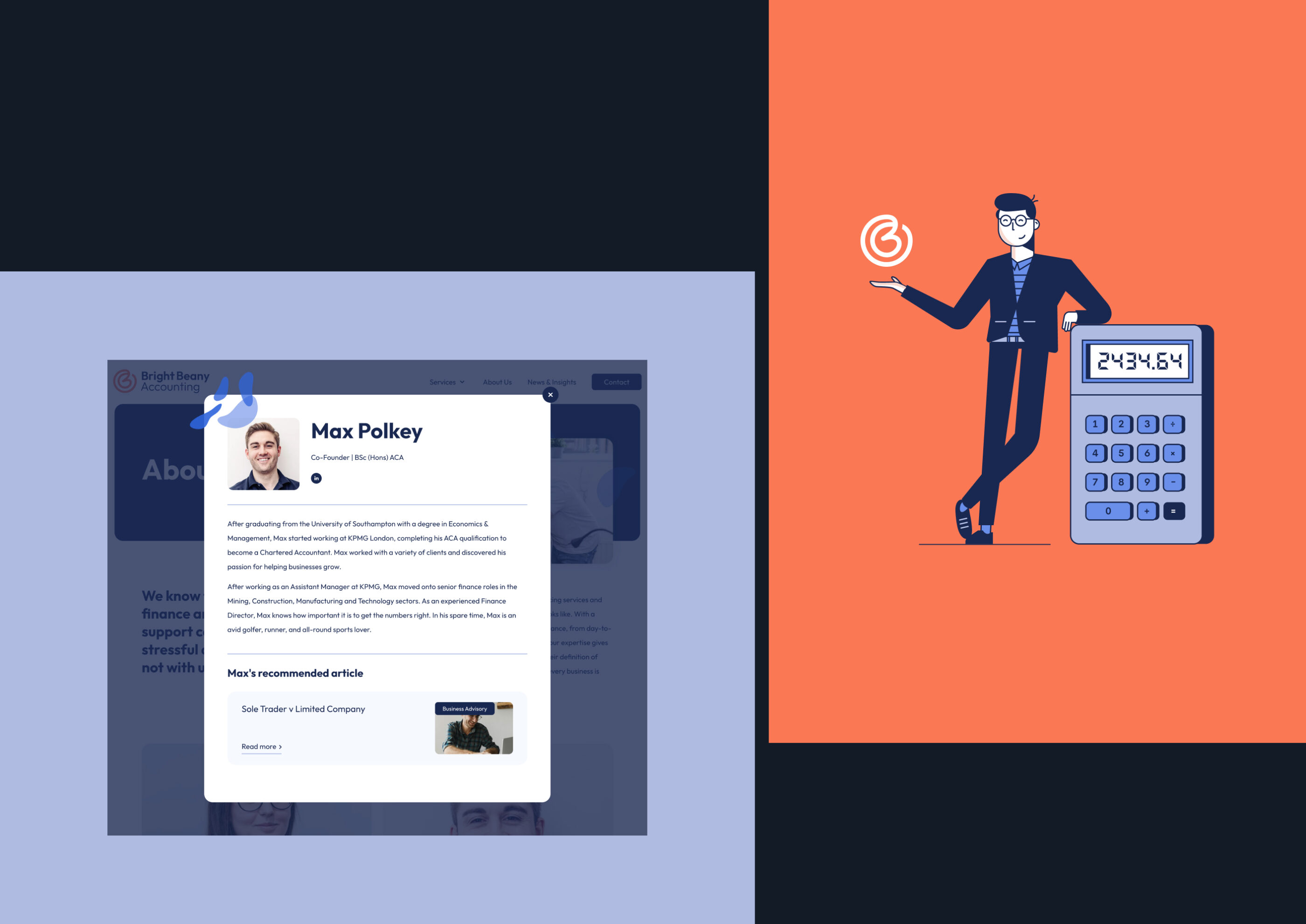
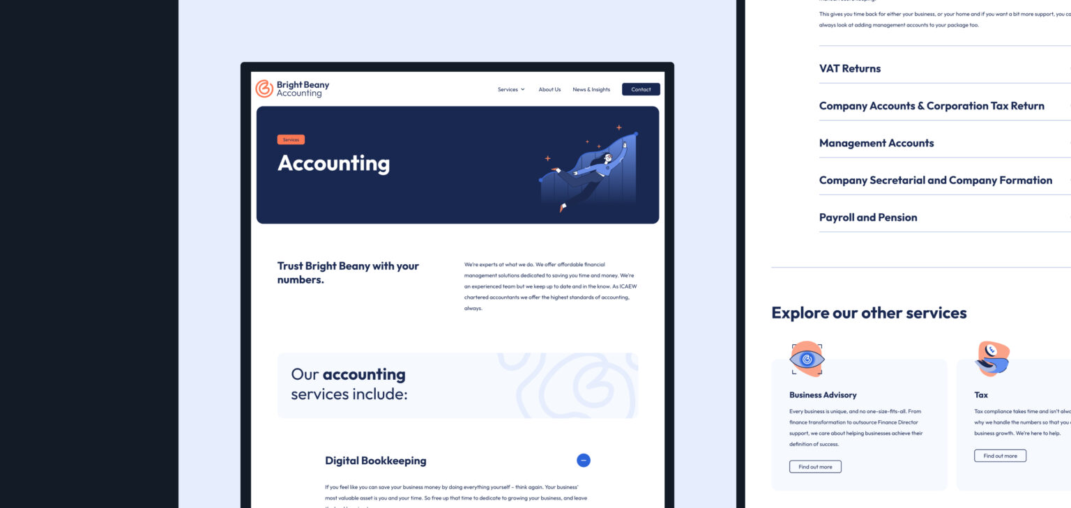
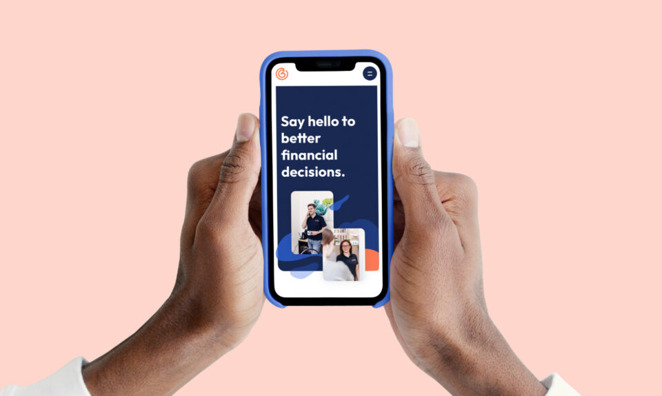
We created a digital brand identity representing the business and team's expertise and reflected their personable, hands-on approach to supporting people who want to grow their businesses.
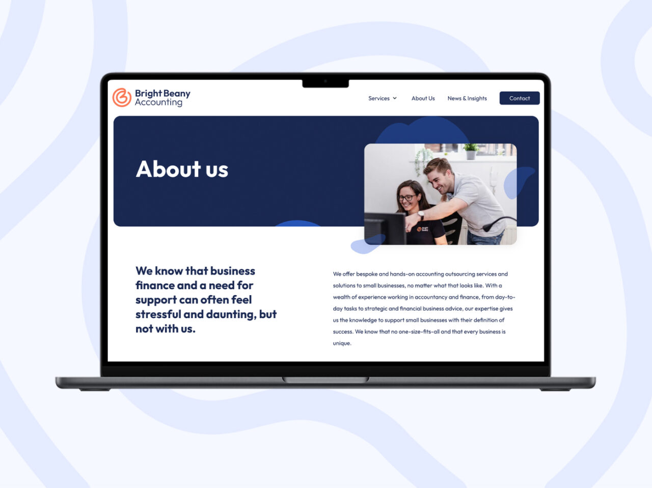
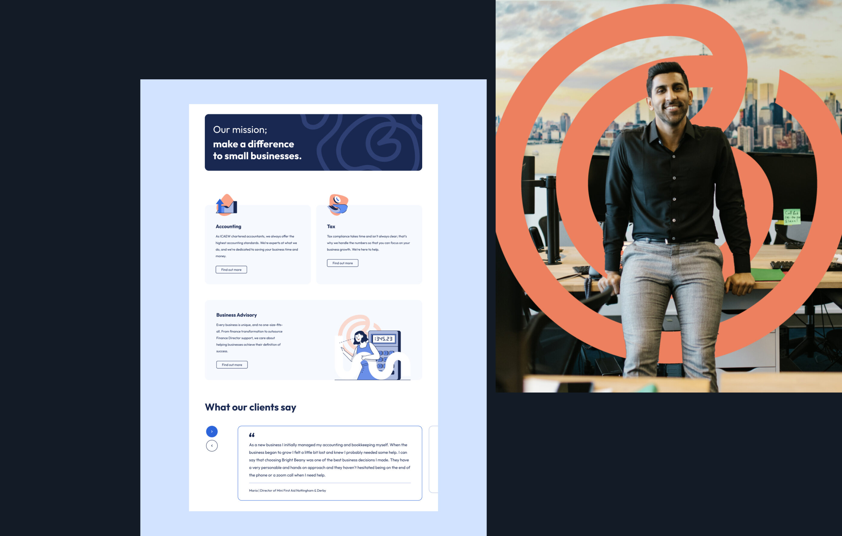
As a startup, we designed and built a website using Craft CMS for an easy, flexible content population and elevated their presence with a brand that didn't feel stressful or daunting, unlike the topic of business finance.

The results
142%
Increase in organic traffic
115%
Increase in engagement time
"Working with Lauren and the team to create my brand was a pleasure.
They did a fantastic job of creating my brand definition and visual identity through their detailed workshops and iterative feedback process. I am looking forward to working with them again on our website project."
Max Polkey | Director & Owner | Bright Beany
Next project
The Real Debt Guy