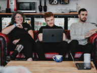
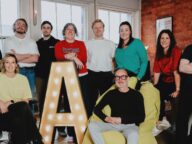
17 / 12 / 20
29th November 2021
As the nights draw in closer and the snow begins to cover what’s left of the autumnal leaves, it becomes difficult to find any colour in our day to day lives. If you’re feeling like you need a little sunlight in your day, let me boost your serotonin levels with some feel-good, vibrant design inspiration.
I've been looking at my favourite (top-notch) design inspiration over the last few months. New to the series? Feel free to catch up with one, two, three, and four, but now it's time to take a look at how some radiant gradients and mood-boosting colour can bring life to your brand, even in the dead of winter.
Lucid is a concept featuring a small device that emits electromagnetic waves, improving the quality of sleep and dreams. The device would gently influence your brain's prefrontal cortex and help you get into a lucid dreaming state more naturally. Designed by agency Fiction Design in Berlin, who wanted to visualise a product from the not-so-distant future. The concept stands out by combining vibrant colours with a contrasting dark blue, creating an almost vaporwave style. The branding also features a futuristic font called Beatrice, with hairline horizontal strokes that shouldn't work but, for some reason, fits perfectly within the overall feel of this cyber-styled brand.
Continuing the futurism theme, Recharger was an immersive exhibition held at Palais des Congrès in Montreal that featured ten works by some of the world’s most prominent digital artists. The exhibition was designed by the agency Caserne who developed the visual identity using warm colour gradients and textures to evoke the sensory aspects of the exhibition. This theme contrasts heavily with the rigid grid and dark colours that create a sense of structure. To add to the space-age theme, Caserne created a custom, fluid typeface.
Another brand that uses bright gradients and gritty textures combined with dark contrasting block colour are The Department of Noise, the leading Swiss agency for audio branding. The new brand identity features simple shapes based on audio technology and displays them to represent wavelengths and DNA strings. This branding project was also designed by the agency Fiction Design.
Designed by the agency tbpmx, Máquina Coffee Roasters is a brand that aims to provide a high-quality coffee at an affordable price whilst still providing fair pay to vendors. The graphic concept revolves around celebrating art through coffee. Máquina Coffee Roasters is an indulgence full of bright colours, handmade artistic techniques, and a bold and playful logo. This brand is a tribute to artists and coffee enthusiasts alike.
Puck is a recruitment hiring platform designed by Jessica Strelioff, an independent designer from Texas. The logo consists of a friendly sans serif with rounded letterforms. To reflect the idea of searching for a perfect team, the unique “p” is designed to reference a magnifying glass. The branding features lovely bright colours, bold typography, and a simple but fun hand-drawn illustration style that all come together to create a delightful, well-thought-out bit of branding.
Do you need help injecting a boost of a simple but much-needed dose of vibrant colour to brighten up your brand? Get in touch to a chat with our team about how we can level up your brand visuals.
Interesting? There’s plenty more where that came from…
We use cookies at Abstrakt to make sure our website user experience is as easy and personal as possible.
By accepting, you are accepting our use of cookies. Alternatively you can change your cookie preferences when using our website.