How we elevate brands online in action
4.5 min read

Your brand lives and breathes in the digital world, which means more consideration is needed for accessibility, responsiveness, colour palette and typography, to name a few.
We also need to consider that your brand exists on a website that has its own list of requirements to work hard, such as page weight, speed, and load times.
We worked with Aganto on elevating their brand for the digital space alongside the design and development of their new website. During our discovery workshop, we discussed the brand and explored the possibilities of progressing the visual identity for digital. Since then, Aganto has taken their new digital brand identity and is rolling it out in the physical space, too.
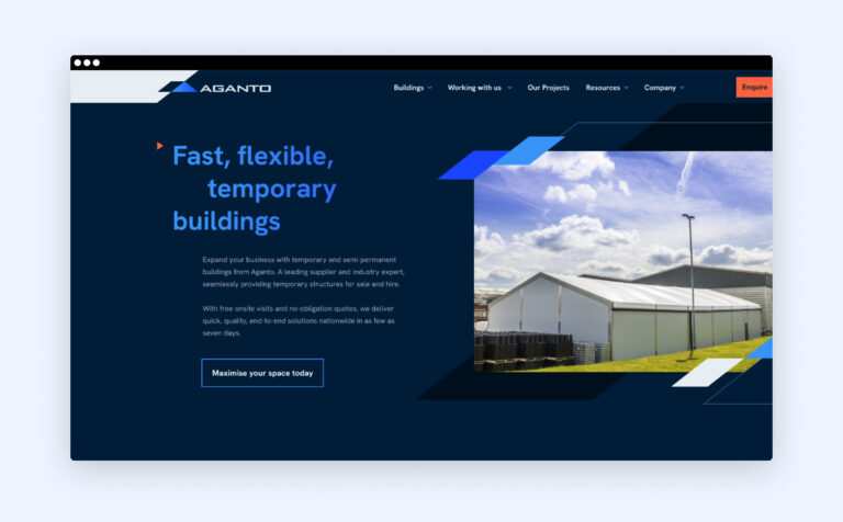
The Abstrakt team understood our objectives and created an exceptional new website, complete with a new brand identity currently being rolled out across the company!
Jonathan Eate - Marketing Manager, Aganto
Let’s dive into Aganto to demonstrate how a brand is elevated online and understand why it’s an essential process for modern web design.
Aganto | Brand elevation case study
Elevating a brand online takes current guidelines often created for the physical world and develops them for the digital space. We do this with purposeful consideration, such as responsive logomarks, accessible colour palettes and typography, producing brand elements or adding motion.
Aganto’s branding before the elevation
Digital logomark
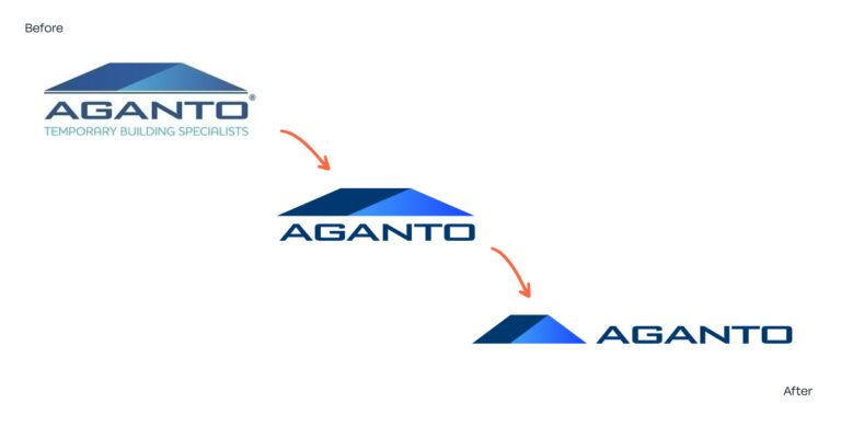
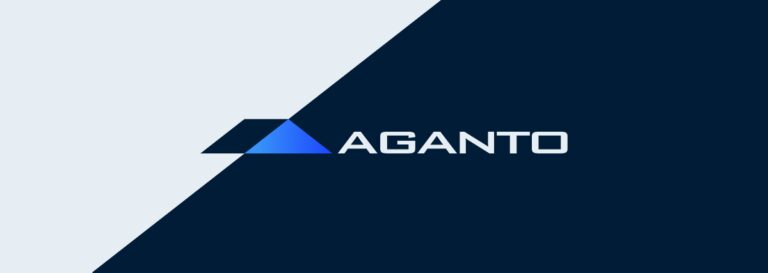
To elevate the logomark and create one that is responsive and accessible, we considered colour and shape for accessibility and size and layout for responsiveness on different devices. This looks like:
- Simplifying the logo to three elements that are clear to identify
- Condensing the shapes to give more height and to balance the logomark
- Vector format instead of CMYK only, so it’s digital and scalable at any size
- Darkening the colours for an improved contrast on screen
- More vibrant blues to catch the eye
- A subtle gradient in homage to the old logo
- The removal of the ‘Temporary Buildings’ strap
Colour palette
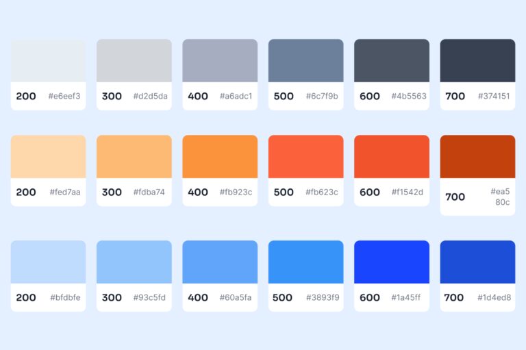
Previously, Aganto’s colour palette was exclusively CMYK, which means it wasn’t accessible for screens.
Accessibility for colour palettes is very important online. Not everyone sees colour in the same way, and over 2.2 billion people are affected by visual impairment. As a web design agency, it’s our duty to create inclusive websites.
When we develop colour palettes, we consider layered elements such as the colour of text, icons and logos on different backgrounds, ensuring they’re clearly distinguishable.
Not all of Aganto’s colour palette passed Web Content Accessibility Guidelines, often referred to in levels as:
A – The minimum level of accessibility has been met
AA – An acceptable level of accessibility has been met
AAA – A completely accessible website
We developed a colour palette that is digital, accessible, adaptable and versatile. That looks like:
Distinguishing Aganto from competitors in an already very blue industry
Deepening the brand’s colours for better contrast and accessibility on screen
Shifting their primary blue from ocean to sky for a more relevant shade in the construction industry
Including new accessible colours for depth and associations with the industry with soft greys (metals and materials) and hot orange (associated with construction) to contrast with the blues for stand out
Typography
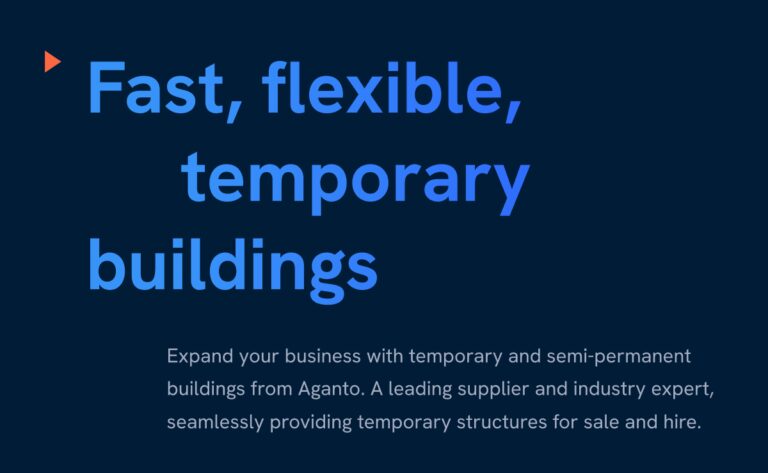
When it comes to typography, it’s not just about using fonts that look good together. Readability is the biggest factor, alongside height, weight (contrast) and spacing. How it looks as headers and body copy, and if readers will feel fatigued or overwhelmed.
We also consider a brand’s personality when choosing typography and how it looks alongside images, components and elements.
For Aganto, we chose Hanken Grotesk, a sans-serif typeface for its boxed edges and straight lines, which feel mechanical, geometric and rigid; great traits for the construction world. The typeface’s hidden flicks and steep curves represent Aganto’s contemporary and down-to-earth personality.
Illustration and iconography

Illustration and iconography visually tell a story where photography often feels lacklustre, and text becomes too much to keep attention. It brings content to life, simplifies complex processes to encourage consumer imagination and adds real expression to a brand.
We created custom iconography for Aganto for the quick reference and scannability of the benefits of their temporary buildings, as well as simple animated illustrations of their types of buildings.
Elements and shapes
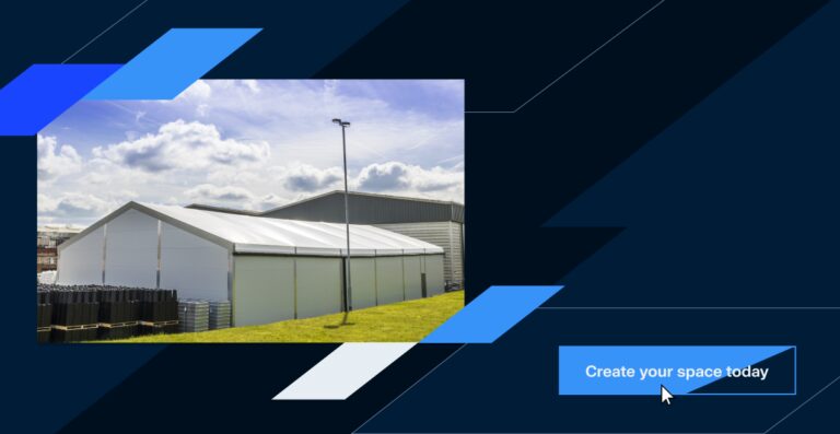
When we elevate a brand online, if it doesn’t have unique brand elements, we introduce them. It adds depth and personality and offers separation between components on a website to ease viewer fatigue— with growing competition, it levels up brands and positions them as bespoke and more credible, too.
We took an element of Aganto’s new digital logomark and introduced it throughout the designs as a shape to connect different components or imagery.
We took the same shape and cut it out across website components and buttons on hover. This adds flair, elevates the branding, and gives Aganto’s whole brand and website a bespoke look and feel.
Motion
Motion on a website comes in many different forms. We split motion into different categories in design from video to animation, and in development, too— JSON animations (GSAP) and advanced CSS animations.
We take into account brand personality and audience and how they want to interact with a website. From logomark load-ins or explainers to easily explain a service or concept, giving a website movement to make it feel tactile: how a button changes on hover, how the brand shapes move or if elements change on scroll.
All of these aspects work together to elevate and develop a brand for the digital space, ensuring it’s inclusive, memorable and leaves a lasting impression of trust and credibility. It ensures accessibility and responsiveness, strengthens brand loyalty and works hard toward better engagement and conversions.
If you’re embarking on a new website project and looking to strengthen your brand with digital elevation as part of the journey, we’d love to discuss how we support reimagining your brand for the digital space.
Not entirely convinced?
20 years of Abstrakt - what changed, what didn’t, and what’s next.
5 min read
Our 2025 client feedback is in - and the results speak for themselves
3 min read
Why B2C brands love Shopify: the pros and cons
4 min read
