Our approach
Websites as unique as your brand.
Digital design
Experts in elevating brands online.
Web development
Specialists in Craft development.
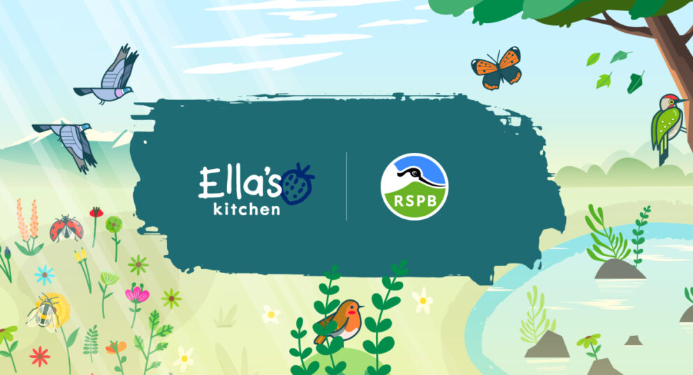
Ella’s Kitchen x RSPB
Bringing nature to life digitally with Rive animation.
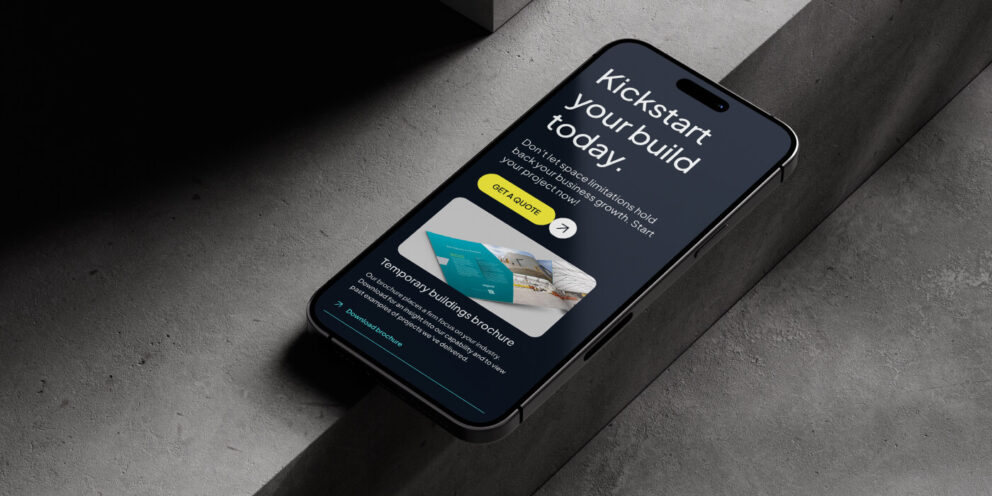
Spaciotempo
A highly polished and bespoke digital brand elevation.
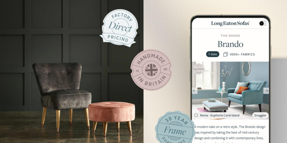
Long Eaton Sofas
Creating an inspiring journey for online product discovery.
All projects
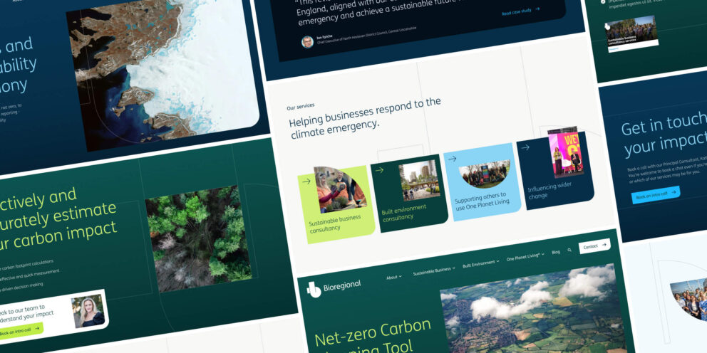
Bioregional
Creating a more flexible content experience.
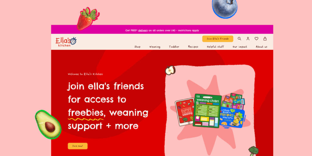
Ella’s Kitchen
Elevating Ella’s brand-first approach online.
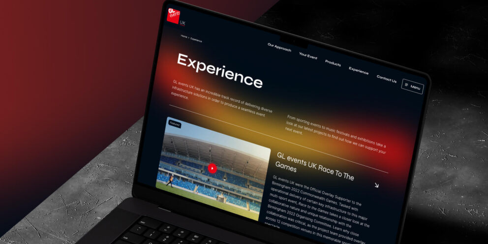
GL events UK
Seamless user journeys and an elevated digital identity.
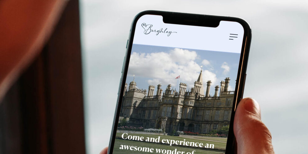
Burghley House
Taking digital branding to the next level.
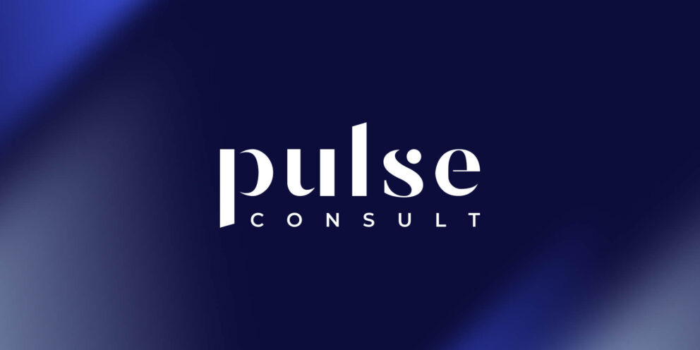
Pulse Consult
Reimaging a brand digitally and enhancing user expectations.
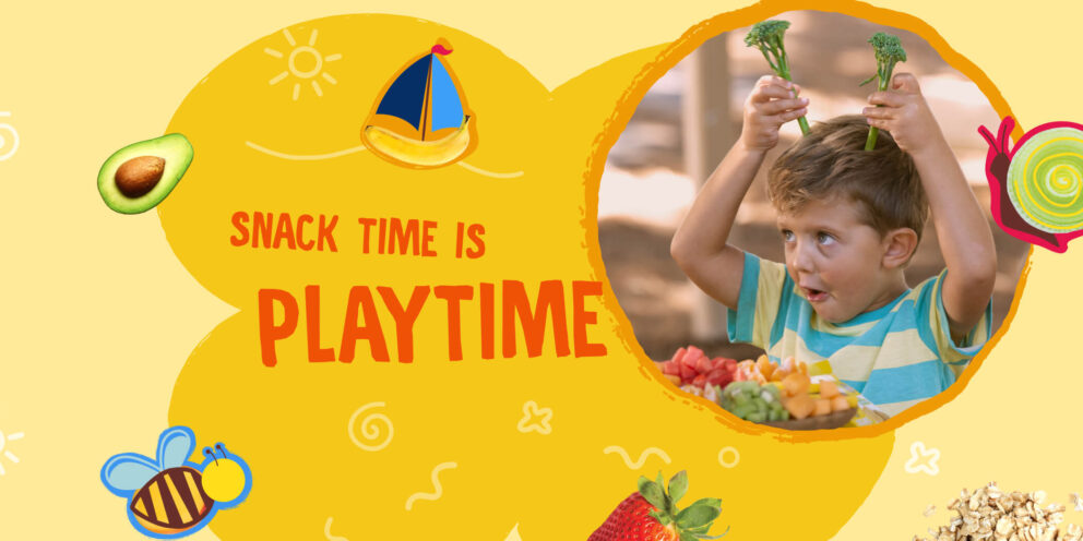
Earth’s Best®
Strengthening brand loyalty and engagement.
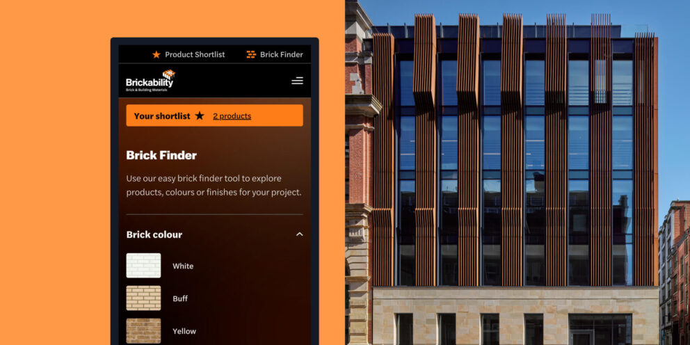
Brickability
Creating a seamless and immersive journey.
More projects
A look at more of our proudest projects
Want a hardworking website? You’re in the right place.
Top