We create digital experiences and complete marketing solutions for B2B and B2C brands.
We're proud to be a B Corp Certified web design and development agency.
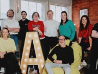
Meet the expert team of specialists behind all of our digital projects.
Explore what our clients and partners have to say about working with the Abstrakt team.
We’re committed to operating with purpose, responsibility, and long-term sustainable thinking.
Explore our projects
Hear from
our clients
B2B
Commerce
120% increase in sessions
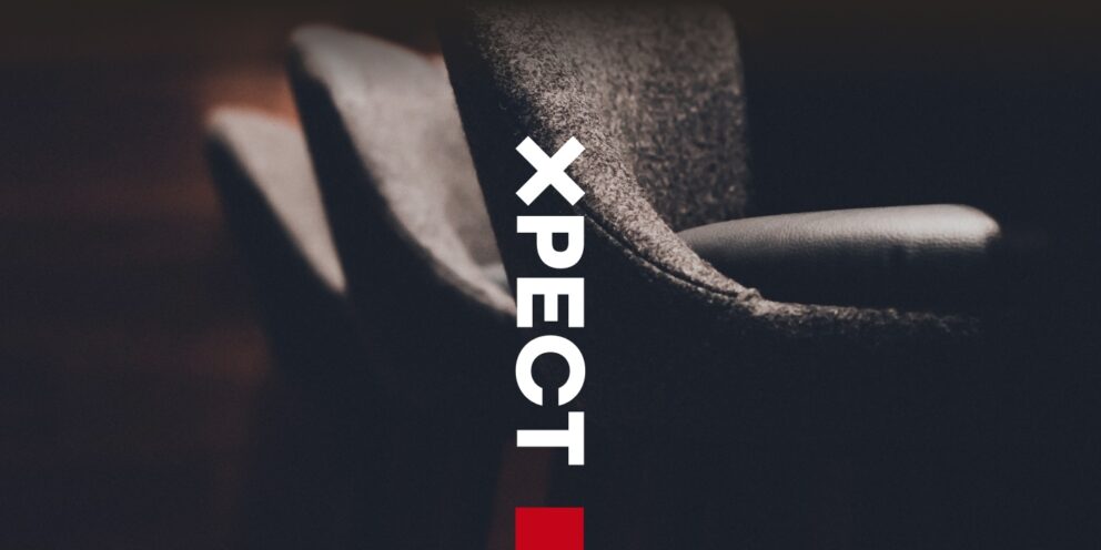
Xpect Furniture
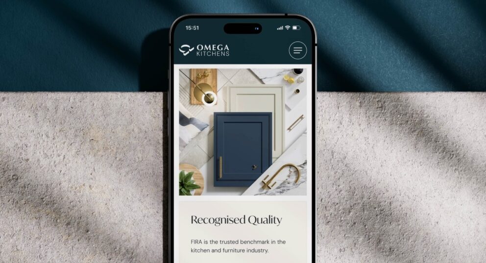
Omega Kitchens
B2C
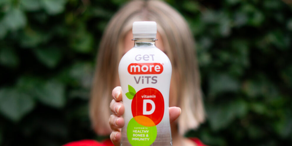
25% increase in revenue
Get More Vits
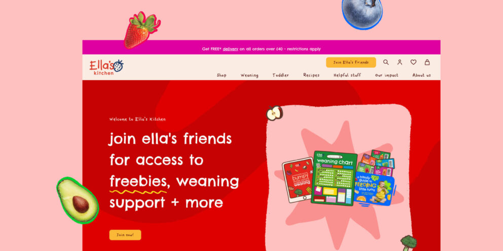
20% increase in revenue
Ella’s Kitchen
Campaign
PiCK UP!
Bahlsen
Top